
Part of Hao Xiaoguang’s vertical world map
TopPhoto via AP Images/Alamy
Alastair Bonnett has an unusual pastime for an expert in mapping: he likes to get lost. A geographer at Newcastle University, UK, Bonnett sees this as a necessary corrective for a society dependent on maps for basic daily activities. “We’re increasingly not good at dealing with not knowing where things are,” he says. “Sometimes it feels like we’re in control; sometimes it feels like the map is in control.”
This ubiquity of maps makes the 21st century a golden era for cartography, says Bonnett. Maps are everywhere, used for everything from tracking the spread of disease to finding where to get your groceries. They have also become an ever-more essential tool in many scientific fields. But Bonnett is concerned that despite our obsession with maps, we don’t always know what makes for a good one, or how people have used them over the centuries. “We need to use this moment to think about the lost traditions of cartography,” he says.
In 40 Maps That Will Change How You See The World, out on 26 September, Bonnett aims to do just that, putting together a tour of diverse cartographic traditions, from the wooden ocean maps of the Marshall Islands to a 500-year-old Aztec depiction of the descendants of regional leader Lord-11 Quetzalecatzin.
Some of the selections, most of which Bonnett came upon by chance and saved for the collection, illustrate rapid planetary change or geopolitical tension. Others – from a map of neurons to a map of smells – challenge the definition of what a map can be. All of them, in his words, “disorient and reorient” us to discover new ways of finding our place in the universe.

A map of the Laniakea Supercluster
MARK GARLICK/SCIENCE PHOTO LIBRARY
This is literally true of the first example from his book, a map of the Laniakea Supercluster, a collection of more than 100,000 galaxies including the Milky Way. The red dot marks Earth’s current location among them as part of the Virgo cluster. The migratory routes of the galaxies as they are pulled along by gravity and shaped by the expanding universe are depicted by the glowing lines. The researchers who made the map compare the way they flow together to form a supercluster to the way water flows within a watershed. Our supercluster, named using the Hawaiian word for “immense heaven”, is around 520 million light years across.

The “Map of the Tracks of Yu”
Alamy Stock Photo
The rational organisation of space that defines most maps in use today has a much longer history. This “Map of the Tracks of Yu” from 12th-century China is what Bonnett calls the first modern map. This is because of the way it represents space on a grid, enabling a reasonably accurate depiction of China’s great rivers and waterways. “Yu” refers to “Yu the Great”, a legendary civil engineer and king said to be responsible for opening up the rivers to navigation. The map was chiselled into stone, which enabled people to make rubbings of it.

This map was purported to show the world as known to Chinese geographers in 1418
China, with a mapping culture extending back millennia, is the source of a number of maps in Bonnett’s book. This one was discovered in 2001 by an amateur historian and was purported to show the world as known to Chinese geographers in 1418. The detailed view of global coastlines, including Australia, decades before Columbus set sail would be extraordinary if genuine, but according to Bonnett it is almost certainly a fake; it doesn’t resemble any other maps from the period and there are no records of the global voyages needed to make it. Still, it is true that “China is home to the most impressive ancient map-making tradition in the world”, he writes.

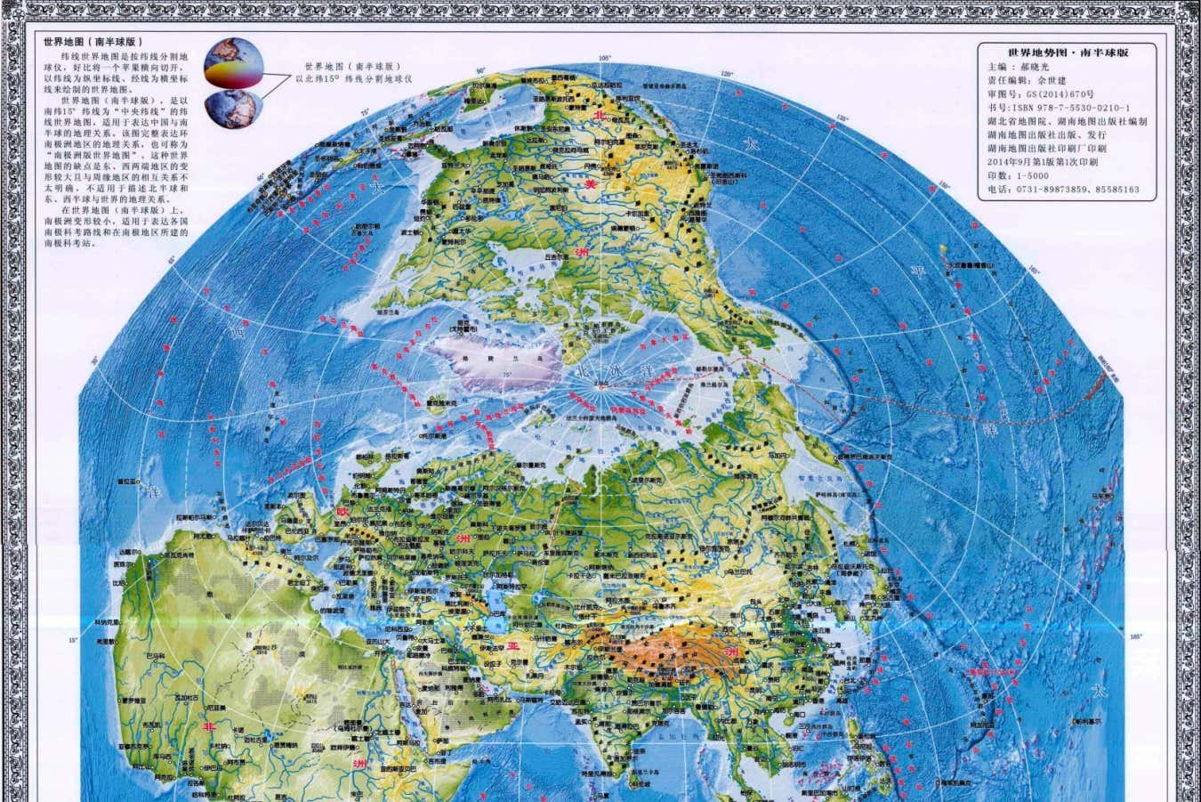
Hao Xiaoguang’s vertical world map
Associated Press / Alamy Stock Photo
Geopolitics is also at play in this modern Chinese map from 2013. The vertical depiction shows Asia at the centre of the world, also highlighting the poles as opposed to hiding them away in the usual manner like “some embarrassing great aunt”, says Bonnett. The effect is to emphasise Asia as the seat of global power and to mark increasingly ice-free polar waters as sites for economic opportunity. Political boundaries have always changed, says Bonnett. However, that is increasingly true of natural features as well. “I don’t think we’ve ever lived at a time where the physical natural map of the world is changing so fast,” he says.

A 16th-century American map, shown in part
Library of Congress
This detail from a map from 1593 shows the Aztec leader Lord-11 Quetzalcatzin (in red) surrounded by his descendants asserting land rights over what is now Mexico’s Puebla and Oaxaca regions. Bonnett calls it “one of the most important maps in the history of the Americas” because it captures a point of cultural transition between Indigenous and post-colonial societies, with elements of the cartographic traditions of both.

Walkability for Women in New York City, 2021
Gorrini, A., Presicce, D., Choubassi, R., Sener, I.N. (2021)
This thoroughly modern map depicts New York neighbourhoods coloured by a “walkability for women” index, with greener areas more walkable and redder areas less so. This was created by a team of researchers based on surveys of women on where they feel safe, along with data on infrastructure and crime. In general, richer parts of the city scored higher than poorer parts. This shouldn’t just be taken at face value, writes Bonnett, but as an illustration of how maps can reproduce existing inequalities. “Maps of walkability are also maps of well-being, sociability and connection.”

This map shows the structure of the planet’s mantle below the Pacific Ocean based on reflected seismic waves
Princeton University
Maps can extend from above Earth to below it. This tangle of colours indicates the structure of the planet’s mantle below the Pacific Ocean based on reflected seismic waves rippling through this region. Produced in 2015 by a team of geoscientists using a supercomputer to crunch the numbers from thousands of earthquakes, it depicts the speed of the waves as they move through different materials that are at different pressures and temperatures within the planet. The slowest speeds are in red and orange, while the fastest are in green and blue. A particular area of interest for Bonnett is the ring of blue on the left side of the map marking the fast-moving tectonic feature known as the Tonga microplate. This image is just one view of a larger project to create a 3D map of Earth’s entire mantle.
40 Maps That Will Change How You See The World by Alastair Bonnett is published by Ivy Press on 26 September in the UK, and on 17 September in the US
Topics: